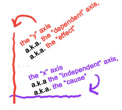
So today I asked a seemingly simple question, why are the graphs in economics drawn the way they are. Above is typically how the "x" and "y" axes are drawn with the dependent variable (that is being acted upon) on the "y" axis. So logically one would expect that the "y" axis is quantity since price acts on it. But no, in economics it is just the other way around. Here is an explanation and apparently it simply comes down to Alfred Marshall's Principle of Economics which was a standard for most college educators (and therefore the standard for all others) in the 20th century. He used geometry in understanding economics (so don't ask me for an explanation). Thanks to Andrew Foos for the link on this question.
This blog on Why are Price and Quantity Reversed? offers a clear explanation of how economists use price–quantity diagrams and why the conventional axes differ from those in other disciplines. The discussion on demand curves and historical reasoning behind the reversal is especially useful for students trying to understand market behavior. Concepts like elasticity and consumer responses become much easier to grasp with such visual clarity. Insights like these are exactly where economics assignment help becomes valuable, supporting learners who want deeper understanding. Great explanation overall!
ReplyDelete